Translate

vendredi 30 octobre 2020

U.S. 2020 no 6 What about the "Shy Trump" hypothesis?

Hi,


In 2016, just before the election, I tested the hypothesis of a "Shy Trump" effect. I personnally prefer to speak about a possible underestimation of the support for Trump since I think that it is possible that  different effects are cumulative: a possible under-representation of Trump supporters in the samples, a possible lower tendency of Trump supporters to answer the polls when they are contacted, and a tendency not to reveal their preference. These effects may not play in the same way and at a similar level for different modes of administration.

In order to simulate a "Shy Trump" effect, I proceed in the same way as I did in 2016. This procedure led me to forecast that the two candidates were quite close than we thought at that time and that Trump could win. I computed the sum of all the undecideds, abstainers and those who say that they support other candidates (a very small proportion). I add these three components because it is easy to figure that "shy respondents" may as well say that they will not vote or that they will vote for another candidate. 

This sum varies from 0 to 23%. It is at 7.5%  on average, at 5.3% for IVR polls, 5.9% for live interviews and 8% for web polls. The fact that it is higher for web polls may say something about the plausibility of a shy Trump effect but it could also be due to the composition of the web samples.

I allocate 67% of that sum -- that we will call the non-disclosers -- to Trump and 33% to Biden. Clearly, the hypothesis is heavily "loaded" for Trump. This would probably be the worst situation.

Now here is the graph that I get after proceeding to that allocation. We now have support for Biden at around 53% and for Trump at 47%. We still have a lead of six points for Biden. We see however that some polls have Trump leading over Biden. Let us look at these estimations by mode.


The next graph shows the estimates of support for the two candidates, with the same non-proportional allocation. As we can see, the web polls estimate the support for Trump at close to 47% but the live interviewer polls' estimate is closer to 48% and the IVR estimates are at 50%. We can conclude that, if there is a substantial underestimation of the support for Trump, "objects may be closer than they appear". We will still have to understand, however, why the telephone polls estimate that support for Trump has been increasing lately when WEB polls show, on the contrary, that it has decreased.


Conclusion

These analyses do not take into account the fact that, if there is an underestimation of the support for Trump, whether it is due to a "shy Trump" effect or to other factors, these effects may occur "in context". They may be more substantial in states or areas that are more pro-Biden for example. One could also argue that a similar "shy Biden' effect is present in states or areas that have a concentration of Trump supporters. This would mean that the two phenomena may cancel each other. We should also remind ourselves that "shyness" is not that likely to occur in polls conducted without interviewers, that is, WEB and IVR polls. Those polls account for 85% of the polls published since September 1st.


We thank Luis Patricio Pena Ibarra for his meticulous work in entering the data and the related information to help me conduct these analyses.

Methodology for the analyses presented in this post.

1) The trends produced are produced by a local regression procedure (Loess). This procedure gives more weigth to estimates that are closer to each other and less to outliers. It is however rather dependent on where the series start. For example, I started this series with the polls conducted after August 1st. This means that all the polls conducted since then influence the trends. If I start on September 1st, the trends are somewhat different because of the absence of the influence of the polls conducted in August. I try to balance the need to have enough polls for analysis and the importance of not having old information influence the trends too much.

2) Every poll is positioned on the middle of its fieldwork, not at the end of it. This seems more appropriate since the information has been gathered over a period of time and reflects the variation in opinion during that period.

3) All the tracking polls are included only once for each period. A poll conducted on three days is included once every three days. In this way, we only include independent data. This is appropriate in statistical terms.

4) The data used comes from the answers to the question about voting intention.

5) For non-Americans, note that, in the USA, IVR ("robopolls") cannot be used to call cell phones.U.S.A. seems to be the only country that has this restriction.

jeudi 29 octobre 2020

U.S. 2020 no 5. Where are we now?

 Hi,

 Five days before the election, and seven days after the second debate, it is time for an update on the polls.  We counted 20 polls that atarted their fieldwork after the debate. Among them, 11 are classified as web polls, 6, IVR and 2, Live phone. We did not find the mode of administration for one poll. This is quite different from the overall distribution since September 1st: 79% Web polls, 14% Live phone and 6% IVR. There are 186 polls total since then.

After reading through each pollster's methodology, I made a few changes in the classification. At first, I had classified all the polls who used IVR as IVR polls. However, some of them have a larger part of their sample coming from web than from IVR. I reclassified them as Web. I also reclassified IBD-TIPP who uses live phone and web as Live phone because the major part of the sample comes from Live phone interviews. NORC also has a small part of its Amerispeak web poll for which interviews are conducted by live interviewers. As you can see, change in methods in this election as compared to 2016, is mostly in the greater reliance on mixed modes. So I decided to compute a new variable to compare the polls using mixed modes and the others.

Where are we now?

The following graph shows that, a few days before the fist debate, support for Biden increased by about one point overall. Since then, support for him is stable or very slightly declining according to the polls. As of yesterday, his support would be at around 55% of voting intentions compared with 45% for Trump.


Let us now examine the difference between modes of administration. As we can see in the following graph, we are still in a situation where the web polls do not show the same trends as IVR or Live interviewer polls. There are a lot less telephone polls than web polls, which means that we have to be careful and not jump to conclusions. However, the portrait is consistent. Polls that mainly use the telephone to reach respondents show an increase in support for Trump while web polls don't. On the opposite, these polls estimate that the support for Trump decreased a little lately. In addition, we still observe that the IVR polls estimate the support for Trump at almost five points more than the web polls, at close to 50%. The live interviewer polls are in between. the IVR polls' estimates are significantly different from the other polls' estimates.


We also wanted to examine whether the use of mixed modes made a difference. The portrait is similar to what we see according to modes. Of course, mixed modes are mostly used in polls that are mainly IVR or live phone but some mainly web pollsters also use mixed mode. On average, polls using mixed modes estimate that the support for Trump has been increasing lately while those using only one mode tend to estimate a slight decline.


If I use a regression to predict support for Trump, controlling for the number of days each poll is in the field and for when the poll was conducted, the effect of mode is the following: The web polls estimate the support for Trump 1.9 points lower than the IVR polls and the Live interviewer polls, 1.6 points lower. When polls use mixed mode, their estimate is 1.2 points higher.

Conclusion

A number of reasons can explain differences in trends and in forecasts according to mode, among them, the source of the samples, the weighting used, the question wordings and the presence of a leaning question, the length of the questionnaire and the number and type of questions that are asked before the voting intention question. There are also substantial differences between web pollsters. The methods used to recruit participants vary from probabilistic panels recruited though telephone or face-to-face interviews, to opt-in panels, to platforms like Lucid or MTurk to recruitment via adds on apps. Whether there are differences by mode of recruitment is another area to explore. I was impressed to see that, although we still have methodological reports missing, the majority of the polls now come with rather detailed information on the methodology. 

In my next post, I will look at the "Shy Trump" hypothesis.

mercredi 21 octobre 2020

US2020 no 4. Who can we trust?

 Hi,

In my fourth post on the polls of this election, 13 days before the election and two days before the second debate, I tried to go deeper into differences between modes, but also between pollsters.

First, let us have a look at the graphs

 The first graph shows the trends in proportional support for Biden and Trump. We need to use this "proportional support", that is the proportion of each on the sum of the two, because there is substantial variation in the proportion of undecideds by pollster and by mode. It ranges from 0% to 12% since September 1st.  It is on average at 2.9% for IVR-misec mode polls, 3.2% for Live interviewer polls and 4.6% for Web polls.

So here are the trends since September 1st.The difference between the support for the two candidates has increased somewhat, from eigth points at the beginning of September to a bit more than 10 points, on average. Biden is clearly ahead in all the polls, except for a few outliers that estimate that the two candidates are very close, this even in October. There are also outliers who estimate the difference between the two candidates at more than 20 points. We will come back to this later on.


Let us now look at the trends by mode.

As we can see, there remains a difference in trends by mode of administration but the discrepancy between modes is becoming smaller. We are heading towards a situation that is very similar as 2016, that is, no difference between web and live interviewer polls (estimate at 45%) and estimates of IVR polls that are higher for Trump (around 46%). However, we see some "outliers", particularly among the web polls. We also still see that the web polls trace a much more stable trend than the telephone polls. In addtion, the decline in support for Trump after the first debate now appears very clearly, whatever the mode use.

Of polls and pollsters

Some people -- all people? -- tend to do some "cherry-picking" of polls. They look only at the polls that are good news for their preferred candidate. However, some pollsters' estimates are quite different from the majority of the other estimates. 

There were 42 pollsters conducting polls since the beginning of September. Of those, 19 (42%) conducted only one poll. these "one shot" pollsters are much less likely to comply with AAPOR's transparency guidelines. For six of them, we do not even know the mode of administration used. One pollster states "The survey included mobile phones, landlines and online" as the only information on the mode of administration. For most of them, we do not  have the question wording. One pollster asks: "Would you vote for President Trump or for Joe Biden?", a clearly biased question. So we need to be careful about these pollsters' estimates.

The following Box and Whiskers plot shows which polls are confirmed statistical outliers and how far these outliers are from the other polls. Survey Monkey's poll conducted from September 30 to October 1st estimates the difference between the proportional support for the two main candidates at 21.5 points. This is an extreme outlier. One AP-NORC's  poll and one Opinium's poll, both conducted from October 8 to October 12, are also outliers with an estimated difference of more than 17 points.  Survey Monkey's poll estimated Trump's support at 39% and AP-NORC and Opinium at 41% while the median of the other web polls is 45%. We cannot really rely on these polls because they are too far from the other polls.

On the other end of the spectrum, one Harris poll, conducted between September 22 and 24 and one IBD/TIPP poll conducted from September 30 to October 1st are also outliers in estimating proportional  support for Trump at close to 49%.


The Box and Whiskers plot (information regarding Box and Whiskers plots can be found here) also confirms that the median -- the horizontal line in the middle -- of IVR-mixed mode polls is higher than the median of the polls using other modes.

Why is that? A number of reasons may explain the differences between modes and between pollsters beside the sources of samples. Among them, variation in question wording. In the vote intention question, some pollsters mention the party for all the candidates, others do not. Some mention the vice-presidents, others do not. Some mention the small candidates, others do not. In addition,  telephone polls tend to use a "leaning question" asked from those who say they are undecided. This tends to reduce the proportion of undecideds. In some very good reports, pollsters reveal the vote of the leaners, a very relevant information. Leaners tend to support Trump more than the respondents who state their preference rigth away. This tends to confirm a possible "shy Trump" tendency. Some pollsters rotate the names of the two main candidates - either Trump or Biden is presented first in the question --, others do not. Unfortunately, information about the use of a leaning question and of rotation is not often mentioned in methodological reports.

The number and type of questions asked before the vote intention question may also have a substantial impact since these questions may influence the answers to the subsequent vote intention question by drawing attention on some issues. The 2020 election may be a good occasion to look at all these methodological features to assess whether they have an impact on estimation. However, for this, we will need the cooperation of the pollsters.

In conclusion

In 2016, the difference between Clinton and Trump was smaller (7 points) at about the same time, that is, before the third debate (see my blog post of October 28 2016 here). The main difference is that in 2016, some pollsters had estimates of Trump and Clinton at par or very close, particularly close to the end of the campaign. In addition, support for Clinton started to decline just before the third debate. In this campaign, since September 1st, one IVR poll has put Trump very slightly ahead of Biden in mid-September and two polls have put the two candidates close to each other at the beginning of October. Since then, polls have been quite unanimous in putting Biden systematically and clearly ahead of Trump. Of course, we know that it is not necessarily enough for Biden to win because of the electoral system and ... because there are still two weeks to go. Meanwhile, we should not "jump to conclusions" when we see polls that fit our view when they differ from other polls conducted at the same time, and even more, when they are conducted using the same mode.


 We thank Luis Patricio Pena Ibarra for his meticulous work in entering the data and the related information to help me conduct these analyses.


Methodology for the analyses presented in this post.

1) The trends produced are produced by a local regression procedure (Loess). This procedure gives more weigth to estimates that are closer to each other and less to outliers. It is however rather dependent on where the series start. For example, I started this series with the polls conducted after August 1st. This means that all the polls conducted since then influence the trends. If I start on September 1st, the trends are somewhat different because of the absence of the influence of the polls conducted in August. I try to balance the need to have enough polls for analysis and the importance of not having old information influence the trends too much.

2) Every poll is positioned on the middle of its fieldwork, not at the end of it. This seems more appropriate since the information has been gathered over a period of time and reflects the variation in opinion during that period.

3) All the tracking polls are included only once for each period. A poll conducted on three days is included once every three days. In this way, we only include independent data. This is appropriate in statistical terms.

4) The data used comes from the answers to the question about voting intention. Undecideds (non-disclosers) are attributed proportionally -- for now.

5) For non-Americans, note that, in the USA, IVR cannot be used to call cell phones.U.S.A. seems to be the only country that has this restriction.

mercredi 14 octobre 2020

US 2020 - no 3: Let's talk about methods

 Hi,

In this message, I update the graphs presented in my preceding posts that show the different trends according to mode of administration. I perform this analysis for the polls conducted since August 1st, in order to compare with my previous post, and since September 1st -- we now have enough polls to limit the analysis to more recent polls. I also add a graph showing the trend in the difference between the two main candidates. The analyses are based on the proportion of Trump voters on the total of Trump and Biden voters. This is the only way to have comparable estimates.

I will also have a section about the methods used by the pollsters. This will allow for better understanding what modes of administration may mean.

Recent trends by mode

The next two figures show the trends in support for Donald Trump by mode of administration. The first graph uses all the polls published since August 1st (n=192), the second one, since September 1st (n=120). We could not find the mode of administration for two polls.

The first graph confirms the tendency observed in my preceding posts. The telephone polls using live interviewers (the dotted  line) and the Interactive Voice Response (IVR) polls (the upper line) both show that support for Trump was increasing until it reached a plateau at the beginning of September and is decreasing since. The web polls (the straight pink line in the middle) do not detect such a movement. They account for 77% of the polls and therefore, they have a substantial weight in the graphs shown by most aggregators.

The graph also shows that, after the debate -- the vertical dotted line -- there is much variation in the estimates of the different web polls. They estimate Trump support between 39% -- the lowest estimate -- and 48%. Most of these polls estimate proportional support for Trump at around 45%.


Before you conclude too early, I refer you to a similar graph in my post at the end of October 2016 here. In 2016, the same downward trend for Trump occurred after the first debate but he could come back afterwards.

If we now examine only the polls conducted after September 1st, here is what we get. It is rather clear that the IVR polls detected a downward trend at least a week before the debate. It is also clear that the web polls do not detect any change. In addition, the IVR polls' estimates are now very close to the web polls estimates while telephone polls -- the dotted line -- estimate Trump support lower than the other polls. However, we need to be careful because there are not that many Live interviewer and IVR polls. Since September 1st, they account for respectively 12 percent and 9 percent of the published polls.


Another way of showing the same information is to examine the difference between support for Trump and Biden. The following graph shows that the difference between the two candidates has been growing steadily since the beginning of September. It went from 2% to 10% according to IVR polls and from 7% to 13% according to Live Interviewer polls. For web polls however, it stayed almost stable around 10%.


Let's talk about methods
How can we explain these differences? We need to examine how the different polls are conducted in order to at least propose hypotheses of explanation. We need to realize first that our classification in three modes hides substantial differences between pollsters using the same mode of administration.

Pollsters who use Live interviewers may have different sampling frame. In the Appendix of the AAPOR Report on the polls of the 2016 election, we noticed that the proportion of cell phones in the samples varied from 25% to 75%. This information is rarely presented by the pollsters. However, one pollster informs that its polls include 80% of cell phones. We may think that people who cannot be joined by cell phone have specific characteristics that are related to vote intention. However, the 2016 analyses did not show any impact of the proportion of cell phones in the samples on estimates.

IVR polls in the U.S. should probably be renamed Mixed mode polls. I have grouped in this category all the pollster who use Interactive Voice Response -- also called robopolls -- to recruit at least a part of their respondents. However, because of the interdiction to use automated calls to cell phones in the U.S., the pollsters using IVR complete their samples with other sources of respondents. In 2016, their samples usually combined 80% of automated calls to landline phones and 20% of cell-only respondents recuited via web opt-in panels. In 2020, there is much more variation and  respondents joined via automated calls to landline phones are often a minority. 

Web polls also vary incredibly in the methods used to recruit respondents. It is not always easy to find the information on the samples. Opt-in panels may not be the norm anymore. Some pollsters complete their opt-in panels with river sampling. Some use platforms like Lucid where respondents are customers of different major commerces. Some use ads on cell phone apps. Some combine different sources of respondents in order to balance the biases that may be associated with each source. 

Why don't web polls detect movement where other modes do? It may be due to more homogenous pools of respondents. However, we will need to get more information from the web pollsters to assess whether different modes of recruitment explain the observed difficulty in detecting movements. In 2016, we did not find any significant difference between the polls that use river sampling and the others. The difficulty of web polls to detect movement has been observed in other elections in other countries. Web pollsters will have to work on -- and are probably already working on -- finding the source of the problem and eventually correct it. Of course, they could also be right but it nonetheless needs to be analysed. It is of utmost importance when web polls account for two thirds of the published polls.

In conclusion

Modes of administration are only one of the differences between pollsters. In a way, we assume that the more variation we have, the more likely the biases will compensate themselves and the average estimates will be the most reliable. However, if one mode is very dominant, and there are differences between modes, it becomes more difficult to conclude on what it happening. Transparency becomes even more essential.

I am also working on question wording. I will come back on this question in a future post. There is much variation in question wordings. Unfortunately, it is difficult to find the information on the  wording used for about a third of the pollsters who published estimates since the beginning of September. It is therefore difficult to assess whether wordings lead to different estimates.


We thank Luis Patricio Pena Ibarra for his meticulous work in entering the data and the related information to help me conduct these analyses.


Methodology for the analyses presented in this post.

1) The trends produced are produced by a local regression procedure (Loess). This procedure gives more weigth to estimates that are closer to each other and less to outliers. It is however rather dependent on where the series start. For example, I started this series with the polls conducted after August 1st. This means that all the polls conducted since then influence the trends. If I start on September 1st, the trends are somewhat different because of the absence of the influence of the polls conducted in August. I try to balance the need to have enough polls for analysis and the importance of not having old information influence the trends too much.

2) Every poll is positioned on the middle of its fieldwork, not at the end of it. This seems more appropriate since the information has been gathered over a period of time and reflects the variation in opinion during that period.

3) All the tracking polls are included only once for each period. A poll conducted on three days is included once every three days. In this way, we only include independent data. This is appropriate in statistical terms.

4) The data used comes from the answers to the question about voting intention. Undecideds (non-disclosers) are attributed proportionally -- for now.

5) For non-Americans, note that, in the USA, IVR cannot be used to call cell phones.U.S.A. seems to be the only country that has this restriction.

mardi 6 octobre 2020

It's all about modes - 2020 Edition - no.2

 Hi everybody,


I thought it was important to follow closely the last polls. Here is what I get. The graphs use all the polls conducted from August 1st to October 5.

The first graph shows the relative support for Donald Trump and Joe Biden. The vertical line represents the debate. It shows that, on average, support for Joe Biden seems to be going up since before the debate but even more since the debate. However, this is the average of all the polls. Therefore, it reflects mostly the web polls because they account for 74% of the polls conducted during the period.


If we examine the trends according to each mode of administration, the portrait is somewhat different. As the following graph shows, the polls that use the telephone, whether with live interviewers or using automated dialing see a clear and more substantial downward trend for Trump than the web polls. And this trend seems to have started way before the debate -- around September 15. As in 2016, web polls do not detect movement where telephone polls do. And IVR polls estimate support for Trump systematically higher than the two other modes.


In conclusion, we should be careful before concluding on the poll trends. The difference between modes persists and it is similar to what we have seen in 2016.

mardi 29 septembre 2020

It's all about modes - US 2020 edition

 Hi everybody,


As many researchers, I am following the polls for this election. I will personnally focus on aspects of the polls that are not that much covered, that is the possible impact of the methodological features of the polls. In this blog post, I focus on whether there is a difference in the trends portrayed by different modes of administration. 

On average

As the first figure shows, the polls conducted since the beginning of August tend to portray an estimated difference of eigth points in support between Joe Biden and Donald Trump. We use a common scale for all the polls, that is, support for each candidate on the sum of the support for the two of them. The portrait traced here is not different from the portrait traced by well-known agregators and news media.


 By mode of administration

However, as in 2016, the trends traced by the different modes of administration tend to differ. IVR polls, that use a combination of automated phone calls to landline phones and web polls to cell-only users, estimate the proportional support for Donald Trump two points higher than the other polls. This was also the case in 2016 just before the first debate between Donald Trump and Hillary Clinton as shown in the AAPOR Report on the polls of the 2016 election

As in 2016, the web polls tend to trace a more stable portrait of the trends. They do not seem to detect movement when other modes do detect some. Finally, the polls that use live interviewers show an increase in support for Donald Trump in August, an increase that is also detected by IVR polls.Whatever the mode used however, trends in support for Donald Trump appear stable since the end of August.


Conclusion

Web polls account for more than 70 percent of the polls. Therefore, the portrait that we get if we do not take mode into account is heavily determined by web polls estimates. In 2016 however, the IVR polls had a slightly better estimate of the support for Donald Trump than the two other modes. We need to take this into account.

Of course, there are slso differences within modes. Web pollsters do not use the same sources of potential respondents. These sources may be more or less probabilistic and some combine different sources. This may have an impact. IVR polls also differ according to the pollster who use them, particularly in terms of the proportion of the sample coming from automated calls to landline phones. Finally, the polls conducted using live interviewers differ in the proportion of cell phones in their samples. In 2016, this proportion varied from 25 to 75 percent. I presented here an average impact of modes but there may be differences within modes, a question that I will try to cover in future posts.

A final note to pollsters and journalists. Mode of administration is an essential methodological information. It should be presented with the main information regarding the dates of fieldwork and the sample size. Sometimes, it is hidden somewhere in the pollster report. It shouldn't be.

vendredi 18 octobre 2019

Are you sure? Êtes-vous certain?

Hi,

Bonjour, la version française suit la versions anglaise, en rouge.

In this post, I concentrate on those respondents that are called the "Undecideds" or the "Discreet". I also add the possible shifters. I ask whether we can better measure who is really undecided and who may change his/her mind. One may think that the proportion of undecideds should decrease during the campaign. However, it can also increase when events lead people to reconsider their position. Therefore, this information may give a hint of what is happening in a campaign and what may happen on election day.

The usual measure of undecidedness is the fact that a respondent states being undecided. However, as I will show, this measure is not that reliable. Therefore, I look at two other measures; the first is the part of voting intentions for each party that is due to "leaners". The second is whether the respondent says that she may change her mind or is not certain of her vote.

Dans ce message, je me concentre sur les répondants que l'on appelle les indécis ou les "discrets". J'ajoute également les possibles transfuges. Je me demande si on peut mieux mesurer qui est vraiment indécis et qui peut changer d'idée. On peut penser que la proportion d'indécis devrait normalement diminuer pendant les campagnes électorales. Toutefois, cette proportion peut aussi augmenter suite à des événements qui peuvent amener l'électeur à questionner ses choix. Par conséquent, cette information peut nous donner des indications sur ce qui se passe et ce qui peut arriver le jour de l'élection. 
La mesure habituelle de l'indécision est la déclaration du répondant qui se dit indécis. Toutefois, cette mesure n'est pas très fiable comme je le montre plus loin. Par conséquent, j'analyse deux autres mesures soit la proportion des appuis à chaque parti qui est due aux répondants qui révèlent leur préférence uniquement à la question de relance et le fait de révéler pouvoir changer d'avis ou être incertain de son vote.

Undecidedness

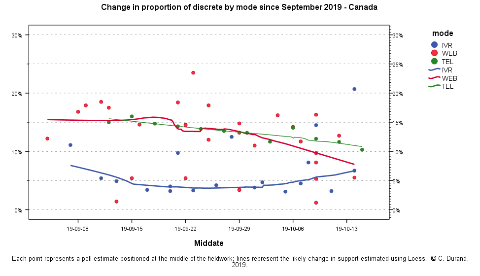
One problem with using stated undecidedness is that it varies much between modes of administration and even between pollsters using the same mode of administration. As we can see in the following graph, IVR (Interactive Voice Response) polls tend to have much lower proportions of undecideds. On the opposite, both Web and telephone polls have a higher proportion but this proportion has  decreased on average since the beginning of the campaign. However, among the IVR pollsters, EKOS has a much higher proportion of undecideds, and among web pollsters, Angus Reid has a proportion of undecideds similar to IVR polls. Therefore, we may conclude that this measure in more an indication of the methodology used by the pollster than of the real proportion of undecideds.

L'indécision

Le principal problème avec la mesure traditionnelle de l'indécision est le fait qu'elle varie beaucoup selon les modes d'administration et même entre les sondeurs utilisant le même mode d'administration. Comme on le voit dans le graphique, les sondages faits par téléphone automatisé (IVR) ont généralement des taux d'indécis plus bas que les sondages Web ou téléphoniques. Par  ailleurs, la firme EKOS a des taux d'indécis plus élevés que les autres sondages IVR alors que Angus Reid a des taux plus bas que les autres sondages WEB. On peut donc conclure que la mesure traditionnelle de l'indécision donne moins une indication de la proportion réelle d'indécis que de la méthodologie utilisée par le sondeur. 


In view of this situation, we turn to another possible indicator of undecidedness. Ipsos, like most other pollsters, ask the vote intention question in "two parts".  It asks all respondents who say they don't know which party they will vote for whether they are leaning towards a specific party. Around 35% to 45% of undecideds to the first question give a preference when asked this second question. Ipsos provided us with their tables for the two questions. We computed the proportion of the vote intention that comes from leaners for each party and each poll since the beginning of September. The following table shows the results.

Devant cette situation, nous nous tournons vers un autre indicateur de l'indécision. Ipsos, comme la plupart des sondeurs, demande la question d'intention de vote en "deux parties". On demande aux personnes qui disent ne pas savoir pour qui elles vont voter si elles "penchent vers un parti". Cette question est appelée la question de relance. De 35% à 45% des indécis à la première question révèlent une intention de vote à la question de relance. Ipsos nous a  gracieusement fourni ses tableaux détaillés. Nous avons calculé la proportion des électeurs de chaque parti qui provenait de personnes ayant répondu à la question de relance.

The graph shows that the proportion of leaners is lower for Conservatives, who tend to state their preference outright. On the opposite, both the LPC and the BQ had higher proportions of leaners at the beginning of the campaign. The proportion of LPC leaners went down to even lower than Conservatives while the proportion of BQ leaners increased and then decreased to the same level as the Conservatives. Meanwhile, the proportion of NDP leaners increased. The difference between parties is not large but this information may say something about what will happen on Election day.  Will the polls overestimate parties with a higher proportion of leaners? Or is the proportion of leaners an indication of a move towards a party that will show on Election Day?

Le graphique montre que la proportion de répondants provenant de la question de relance est moins élevée chez les partisans du PCC. Ces derniers tendent à révéler leur intention de vote dès le départ. À l'opposé, une plus grande proportion des partisans du PLC et du Bloc provenait de répondants à la question de relance au début de la campagne. Cette proportion a diminué chez les partisans du PLC alors que du côté du Bloc, elle a d'abord augmenté pour ensuite diminuer. Enfin, la proportion des répondants provenant de la question de relance a augmenté chez les partisans du NPD. Les proportions selon les partis ne sont pas très différentes mais ceci peut donner des indications sur ce qui peut se passer le jour de l'élection. Est-ce que les sondages surestimeront les partis dont une plus grande proportion des appuis vient de la question de relance? Ou au contraire, cette proportion indique-t-elle qu'il y a un mouvement vers un parti qui se matérialisera le jour de l'élection?


And what about possible shifters?

Both my research with André Blais for the Quebec 2018 election and the CES 2004 data show that polling misses may sometimes be explained by people changing minds disproportionately towards one party. Ipsos asks respondents who state a preference whether they are very certain, fairly certain, not very certain or not at all certain of their choice. Léger has a different question. The pollster asks whether the respondent's choice is final or whether it may change (a don't know option is also presented).

Qu'en est -il des possibles transfuges?
Tant ma recherche avec André Blais sur les sondages de l'élection québécoise de 2018 que les données de l'Enquête électorale canadienne de 2004 montrent que les erreurs des sondages peuvent parfois s'expliquer par le fait que des électeurs changent d'avis de façon disproportionnée en faveur d'un parti. Ipsos demande aux répondants jusqu'à quel point ils sont certains de leur choix. Léger quant à lui demande si le choix est définitif ou s'il peut changer. La possibilité de dire qu'on ne sait pas est également offerte. 
 
Are you certain?

The following graph shows the proportion of respondents who were not very or not at all certain of their choice for the polls in which the question was asked, by party, since mid-August. It shows that first, the proportion of not certain respondents has decreased since August and second, this proportion is lower for Conservative voters and higher for the Greens. However, like the proportion of leaners, it decreased for Liberal voters and it increased and then decreased among Bloc supporters. For the NDP, the proportion has decreased, in this case unlike the proportion of leaners.

Êtes-vous certain?
Le graphique suivant montre la proportion de répondants qui ont dit ne pas être beaucoup ou pas du tout certains de leur choix, par parti politique depuis la mi-août. Il montre d'abord que la proportion de répondants "non certains" a diminué depuis août, surtout plus récemment. Cette proportion est par ailleurs plus basse pour les Conservateurs et plus élevée pour les Verts. Toutefois, tout comme la proportion de répondants provenant de la question de relance, cette proportion a diminué chez les supporteurs du PLC  et elle a augmenté puis diminué chez les partisans du Bloc. Pour le NPD, la proportion a diminué, contrairement dans ce cas à la proportion provenant de la relance.


May you change?
We can compare these results with Léger's answers to the question about the possibility of changing minds. We group together those who say they may change and those who say they do not know because these two proportions tend to be related. The proportion of "may change and don't know" is higher than the proportion of "not certain" but the conclusions are quite similar. The proportion of possible shifters has slightly decreased during the campaign and it is generally lower for the partisans of the main parties. The proportion of possible shifters amond NPDers has slightly decreased. The proportion of possible shifters among Bloc supporters has been lower than that of the NDP from the beginning and it has increased and then decreased to reach a level similar to the main national parties. This result is confirmed by the last Léger conducted in Quebec only.

Pouvez-vous changer?
Nous pouvons comparer les résultats précédents à ceux fournis par Léger à la question relative à la possibilité de changer d'idée. Nous avons regroupé les répondants qui disaient pouvoir changer et ceux qui disaient ne pas savoir si leur choix était définitif. La proportion de ces deux catégories groupées est plus élevée que celle des "non certains" de IPSOS mais les conclusions sont similaires. La proportion de possibles transfuges a légèrement diminué au cours de la campagne et elle est généralement plus basse chez les partisans des deux principaux partis. La proportion de possibles transfuges a légèrement diminué chez les partisans du NPD. Chez les partisans du Bloc, cette proportion était plus basse que pour le NPD au départ et elle a augmenté puis diminué pour se retrouver au même niveau que celle des partis principaux, ce qui est confirmé par le dernier sondage Léger réalisé au Québec seulement.


Does it tell us something about Election day results? We have the same data from Léger in 2015. The proprotion at that time was higher than in 2019. The following graph helps us interpret what this question means. In short, in 2015,  an election characterized by movement between the NDP and the LPC until the end of the campaign.
the following graph shows that the proportion of possible shifters is similar for the LPC and NDP supporters during the whole campaign. We may tentatively conclude that this proportion is indicative of possible movements between parties. 

Est-ce que ces informations nous donnent une idée sur ce qui risque de se passer le jour des élections? Le graphique suivant aide à interpréter ce que signifie cette question. En 2015, la proportion était plus élevée qu'en 2019. En résumé, en 2015, une élection caractérisée par des mouvements entre le NPD et le PLC jusqu'à la fin de la campagne, le graphique suivant montre que la proportion de possibles transfuges est demeurée similaire pour les partisans du PLC et du NPD tout au long de la campagne. On pourrait conclure que cette proportion de possibles transfuges est un bon indicateur des mouvements possibles entre les partis.


Conclusion

We cannot know whether these measures of undecidedness and possible shifts are really informative of what may happen on Election day. However, it is a complement to the usual information about the proportion of "undecideds" to the vote intention question. One conclusion is that Conservatives are more likely to be decided and seem to have nowhere to go. This is confirmed by the question on the second choice asked by Leger in its October 7-8 poll. The CPC supporters are the less likely to say they have a second choice. Liberals' second choice is clearly the NDP. NPD supporters' second choice is split between the LPC and the Greens. The Greens' second choice is the NDP and almost nobody has the Bloc as a second choice. Unfortunately, this question is not present in the last Léger poll conducted only in Quebec. It stays that at the national level, the Léger poll shows that the NDP is the most important "second party" (25%) followed by the Greens (16%) and the LPC (13%).

I wish to thank Luis Peña Ibarra for his assistance with all the analyses and compilation of results in this election. I also wish to thank IPSOS (Sébastien Dallaire) who provided me with tables that are not normally public. I also thank Léger (Christian Bourque) for providing me with the 2015 Léger reports.

En conclusion, nous ne pouvons pas encore dire si ces nouvelles mesures d'indécision et de possibles mouvements nous informent de ce qui se passera le jour de l'élection. Toutefois, ces mesures sont  un bon complément à l'information sur la traditionnelle proportion d'indécis.  Une conclusion à tirer est que les Conservateurs sont plus souvent décidés mais semblent avoir nulle part où aller. Ceci est confirmé par les résultats de la question sur le deuxième choix posée par Léger dans son sondage du 7-8 octobre. Les partisans du PCC sont les moins susceptibles d'avoir un deuxième choix. Le deuxième choix des Libéraux est clairement le NPD. Les partisans du NPD privilégient les Libéraux et les Verts dans la même proportion. Presque personne n'a le Bloc comme second choix. Malheureusement, le dernier sondage Léger réalisé au Québec seulement ne présente pas cette question. Il demeure qu'au niveau national, le NPD est le plus important deuxième choix (25%) suivi des Verts (16%) et du PLC (9%).

Je tiens à remercier Luis Peña Ibarra pour son assistance dans l'ensemble des analyses portant sur cette campagne électorale. Je tiens également à remercier Ipsos (Sébastien Dallaire) pour leur précieuse collaboration et entre autres pour m'avoir fourni des tableaux qui n'étaient pas normalement publiés. Enfin, je tiens également à remercier la firme Léger (Christian Bourque) qui m'a fourni les rapports Léger de 2015.